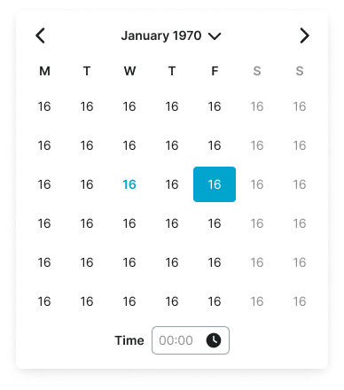
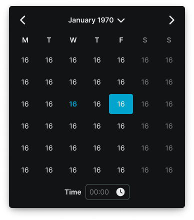
date-picker
Input components that provide a calendar interface for users to select dates, date ranges, or specific time periods.
Configurable properties that control the appearance, behavior, and functionality of date picker components for temporal selection and calendar navigation management.
Day Item
Properties that define the visual state and interactive behavior of individual date elements within calendar structures.


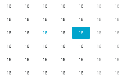
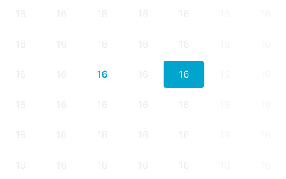
state variant
Controls the visual state and interactive feedback of the day element based on date context, user interaction, and selection status.
- default
- today
- weekend
- outside
- active
- range-start
- range-end
- range-middle
- range-today
- hover
- hover-today
Nav Item
Properties that define the visual type, state, and navigation functionality of temporal movement elements within date picker interfaces.


type variant
Controls the navigation functionality and directional role of the navigation element based on temporal movement requirements.
- dropdown
- prev
- next
state variant
Controls the interactive state and visual feedback of the navigation element based on user interaction and availability status.
- idle
- hover
- press
has-caret boolean
- type:
- dropdown
Controls the visibility of a dropdown indicator that signals available selection functionality for direct month or year navigation.
- true
- false
Label Item
Properties that define the visual state and interactive behavior of label elements within year and month selection interfaces.


state variant
Controls the visual state and interactive feedback of the label element based on user interaction and selection status.
- idle
- hover
- active
Title Row
Properties that define the navigation interface structure and temporal display format of header elements within calendar layouts.


type variant
Controls the navigation interface structure and temporal display format of the title row based on date picker complexity requirements.
- basic
- separate
- today
Weekdays Row
Properties that define the weekday label presentation format of header elements within calendar layouts.


type variant
Controls the weekday label presentation format and space utilization of the weekdays row based on calendar layout requirements.
- letters
- short
Time Row
Properties that define the time input structure and entry method of time selection elements within date-time picker interfaces.


type variant
Controls the time input structure and entry method of the time row based on temporal specification requirements.
- text
- select
Dates Block
Properties that define the calendar template organization and layout configuration of calendar grid elements.
type variant
Controls the calendar template organization and week arrangement of the dates block based on month layout optimization requirements.
- basic
- jan-70
- feb-70
- march-70
- feb-71
- months
- years
has-week-5 boolean
- type:
- basic
Controls the visibility of the 5th week row in months view.
- true
- false
has-week-6 boolean
- type:
- basic
Controls the visibility of the 6th week row in months view.
- true
- false
Date Picker
Properties that define the interface structure, selection capabilities, and optional features of complete date selection components.
type variant
Controls the interface structure and selection functionality of the date picker component, determining single-month or dual-month range selection with vertical or horizontal layouts.
- single
- vertical
- horizontal
has-time boolean
Controls the visibility and inclusion of time selection functionality within the date picker interface for date-time input requirements.
- true
- false
has-presets boolean
- type:
- horizontal
Controls the visibility and inclusion of preset date range shortcuts within the date picker interface for quick selection convenience.
- true
- false