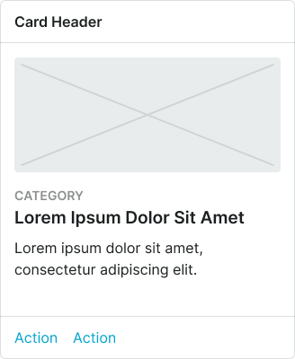
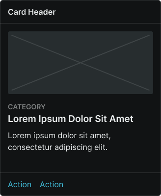
card
Container components that group related content and actions about a single subject, presenting information in scannable, visually distinct blocks.
Configurable properties that control the appearance, behavior, and functionality of card components for content organization and structured presentation interfaces.
Card
Properties that define the visual state and content organization of container elements that present related information within structured layouts.
size variant
Controls the dimensional scale and content presentation of the card to optimize usability across different screen sizes and device capabilities.
- large
- medium
- small
orientation variant
Controls the placement and orientation of image elements within the card structure, determining the visual hierarchy and content flow.
- top
- bottom
- left
- right
has-image boolean
Controls the visibility of image elements that provide visual context and media representation within the card content.
- true
- false
has-header boolean
Controls the visibility of a header section that provides card identification, context, and supplementary functionality.
- true
- false
has-footer boolean
Controls the visibility of a footer section that contains action elements and interactive controls for card functionality.
- true
- false
has-category boolean
Controls the visibility of category labeling that provides content classification and organizational context within the card.
- true
- false
has-body boolean
Controls the visibility of body text content within the card.
- true
- false
Card Header
Properties that control the layout and functionality of card header elements that provide identification and contextual information.


has-icon boolean
Controls the visibility of an icon element that provides visual identification and categorization within the card header.
- true
- false
icon-instance instance-swap
- has-icon:
- true
Specifies which icon component to display when has-icon property is enabled.
- Icon Placeholder
has-assist boolean
Controls the visibility of assistance elements that provide supplementary functionality and contextual actions within the card header.
- true
- false
assist-type variant
- has-assist:
- true
Controls the type of assistance element displayed when has-assist property is enabled, determining the specific functionality and visual presentation.
Card Footer
Properties that control the layout and functionality of card footer elements that provide action controls and interactive functionality.


type variant
Controls the layout and interaction pattern of footer elements, determining the arrangement and presentation of action controls within the card footer.
- basic-actions
- horizontal-buttons
- vertical-buttons
has-2nd-action boolean
Controls the visibility of a secondary action element when multiple user response options are needed within the card footer.
- true
- false
has-assist boolean
Controls the visibility of assistance elements that provide supplementary functionality and contextual actions within the card footer.
- true
- false
assist-type variant
- has-assist:
- true
Controls the type of assistance element displayed when has-assist property is enabled, determining the specific functionality and visual presentation.