card
Container components that group related content and actions about a single subject, presenting information in scannable, visually distinct blocks.
Technical specifications and design system values that define the visual and structural properties of card components. These specifications ensure consistent implementation across design tools and development environments.
Legend:
- Brackets (
[]) denote a component variant placeholder. - Full emphasis indicates a value specific to that variant.
- Dimmed indicates a value unchanged from the default variant.
Card
Specifications for card container elements including measurements, colors, typography, and styling attributes. These values define the core appearance and content presentation properties for each card variant.
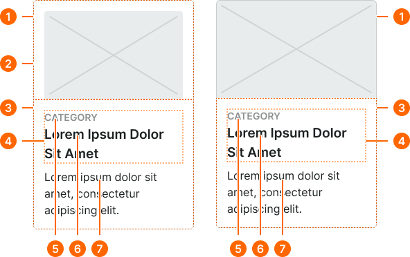
1
Contained Card / Full-bleed Card
- fill:
- color.context.default.bg-main
- borderColor:
- color.context.default.border-subtle
- borderRadius:
- borderRadius.card.main
- borderWidth:
- borderWidth.card.main
2
Image Frame
Contained cards only.
- orientation:
- top
- paddingTop:
- space.context.[size]
- paddingRight:
- space.context.[size]
- paddingBottom:
- space.context.zero
- paddingLeft:
- space.context.[size]
- orientation:
- bottom
- paddingTop:
- space.context.zero
- paddingRight:
- space.context.[size]
- paddingBottom:
- space.context.[size]
- paddingLeft:
- space.context.[size]
- orientation:
- left
- paddingTop:
- space.context.[size]
- paddingRight:
- space.context.zero
- paddingBottom:
- space.context.[size]
- paddingLeft:
- space.context.[size]
- orientation:
- right
- paddingTop:
- space.context.[size]
- paddingRight:
- space.context.[size]
- paddingBottom:
- space.context.[size]
- paddingLeft:
- space.context.zero
3
Content Frame
- size:
- medium
- verticalPadding:
- space.context.[size]
- horizontalPadding:
- space.context.[size]
- itemSpacing:
- space.context.xsmall
- size:
- large
- verticalPadding:
- space.context.[size]
- horizontalPadding:
- space.context.[size]
- itemSpacing:
- space.context.small
- size:
- small
- verticalPadding:
- space.context.[size]
- horizontalPadding:
- space.context.[size]
- itemSpacing:
- space.context.2xsmall
4
Title Frame
- itemSpacing:
- space.context.zero
5
Category Text
- fill:
- color.context.default.fg-subtle
- typography:
- font.context.label.[size]
6
Title Text
- fill:
- color.context.default.fg-main
- typography:
- font.context.title.[size]
7
Body Text
- fill:
- color.context.default.fg-main
- typography:
- font.context.body.[size]
Card Header
Specifications for header elements displayed at the top of cards. These values ensure consistent presentation of titles, icons, and introductory content.
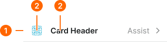

1
Card Header
Local component
- size:
- medium
- verticalPadding:
- space.context.small
- horizontalPadding:
- space.context.[size]
- itemSpacing:
- space.context.[size]
- borderColor:
- color.context.default.border-subtle
- borderWidthBottom:
- borderWidth.card.main
- size:
- large
- verticalPadding:
- space.context.medium
- horizontalPadding:
- space.context.[size]
- itemSpacing:
- space.context.[size]
- borderColor:
- color.context.default.border-subtle
- borderWidthBottom:
- borderWidth.card.main
- size:
- small
- verticalPadding:
- space.context.xsmall
- horizontalPadding:
- space.context.[size]
- itemSpacing:
- space.context.[size]
- borderColor:
- color.context.default.border-subtle
- borderWidthBottom:
- borderWidth.card.main
2
Header Icon
- height:
- size.icon.glyph.[size]
- width:
- size.icon.glyph.[size]
- fill:
- color.context.default.icon-main
2
Header Text
- fill:
- color.context.default.fg-main
- typography:
- font.text.[size].strong
Card Footer
Specifications for footer elements displayed at the bottom of cards. These values ensure consistent presentation of actions, metadata, and supplementary information.


1
Card Footer
Local component
- size:
- medium
- verticalPadding:
- space.context.small
- horizontalPadding:
- space.context.[size]
- itemSpacing:
- space.context.[size]
- borderColor:
- color.context.default.border-subtle
- borderWidthBottom:
- borderWidth.card.main
- size:
- large
- verticalPadding:
- space.context.medium
- horizontalPadding:
- space.context.[size]
- itemSpacing:
- space.context.[size]
- borderColor:
- color.context.default.border-subtle
- borderWidthBottom:
- borderWidth.card.main
- size:
- small
- verticalPadding:
- space.context.xsmall
- horizontalPadding:
- space.context.[size]
- itemSpacing:
- space.context.[size]
- borderColor:
- color.context.default.border-subtle
- borderWidthBottom:
- borderWidth.card.main
2
Action Text
- fill:
- color.context.default.link-main
- typography:
- font.text.[size].normal