Navigation components that organize content into multiple panels, with only one panel visible at a time, allowing users to switch between related content sections.
Technical specifications and design system values that define the visual and structural properties of tab components. These specifications ensure consistent implementation across design tools and development environments for navigation and content organization interfaces.
Legend:
- Brackets (
[]) denote a component variant placeholder. - Full emphasis indicates a value specific to that variant.
- Dimmed indicates a value unchanged from the default variant.
Tab Item
Specifications for individual tab navigation elements including measurements, colors, typography, and styling attributes. These values define the core appearance and behavior properties for each tab item variant with interactive navigation capabilities.
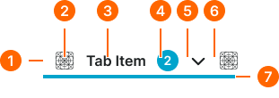
1
Tab Item
- size:
- medium
- verticalPadding:
- space.context.xsmall
- horizontalPadding:
- space.context.small
- itemSpacing:
- space.context.small
- size:
- large
- verticalPadding:
- space.unit.10
- horizontalPadding:
- space.context.medium
- itemSpacing:
- space.context.medium
- size:
- small
- verticalPadding:
- space.unit.6
- horizontalPadding:
- space.context.xsmall
- itemSpacing:
- space.context.xsmall
2
Start Icon
- height:
- size.icon.glyph.[size]
- width:
- size.icon.glyph.[size]
- fill:
- color.context.default.fg-[state]
3
Label Text
- fill:
- color.context.default.fg-[state]
- typography:
- font.tab.[size]
4
Badge Frame
- state:
- idle, hover, press
- opacity:
- opacity.level.solid
- state:
- disabled
- opacity:
- opacity.context.fg-slight
5
Dropdown Caret
- variant:
- medium
- height:
- size.icon.glyph.small
- width:
- size.icon.glyph.small
- fill:
- color.context.default.fg-[state]
- variant:
- large
- height:
- size.icon.glyph.medium
- width:
- size.icon.glyph.medium
- fill:
- color.context.default.fg-[state]
- variant:
- medium
- height:
- size.icon.glyph.xsmall
- width:
- size.icon.glyph.xsmall
- fill:
- color.context.default.fg-[state]
6
End Icon
- height:
- size.icon.glyph.[size]
- width:
- size.icon.glyph.[size]
- fill:
- color.context.default.fg-[state]
7
Indicator
- state:
- idle, hover, press
- height:
- size.asset.indicator
- fill:
- color.context.default.cue-main
- state:
- disabled
- height:
- size.asset.indicator
- fill:
- color.context.default.cue-slight
Tab Bar
Specifications for tab container elements including measurements, colors, layout constraints, and organizational styling attributes. These values define the structural properties and navigation framework for tab bar variants with content organization capabilities.

