Navigation components that organize content into multiple panels, with only one panel visible at a time, allowing users to switch between related content sections.
Configurable properties that control the appearance, behavior, and functionality of tab components for navigation and content organization interfaces.
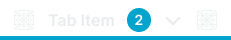
Tab Item
Properties that define the visual state and interactive behavior of individual tab navigation elements within tabbed interface systems.

size variant
Controls the dimensional scale and proportional relationships of the tab item component to accommodate different interface densities.
- large
- medium
- small
state variant
Controls the interactive feedback and visual response of the tab item based on user interaction and engagement.
- idle
- hover
- press
- disabled
is-active variant
Controls the selection state and activation status of the tab item, determining the visual prominence and current content indication.
- true
- false
has-icon-start boolean
Controls the visibility of an icon element positioned before the tab label for visual identification and categorization.
- true
- false
icon-start-instance instance-swap
- has-icon-start:
- true
Specifies which icon component to display when has-icon-start property is enabled.
- Icon Placeholder
has-badge boolean
Controls the visibility of a badge element that provides additional status, count, or notification information within the tab item.
- true
- false
is-dropdown boolean
Controls the display of dropdown functionality that reveals additional navigation options or sub-sections from the tab item.
- true
- false
has-icon-end boolean
Controls the visibility of an icon element positioned after the tab label for additional visual context or functionality indication.
- true
- false
icon-end-instance instance-swap
- has-icon-end:
- true
Specifies which icon component to display when has-icon-end property is enabled.
- Icon Placeholder
Tab Bar
Properties that control the layout and presentation structure of tab container elements that organize multiple navigation items.


type variant
Controls the visual presentation mode and design treatment of the tab bar container based on interface aesthetic and navigation requirements.
- top
- bottom
- fancy