chart
Data visualization components that represent information graphically through various chart types like bar, line, pie, and donut charts.
Configurable properties that control the appearance, behavior, and functionality of chart components for data visualization and analytical presentation interfaces.
Bar Chart
Properties that define the visual state and data presentation of bar chart elements that represent comparative data through rectangular visualization.
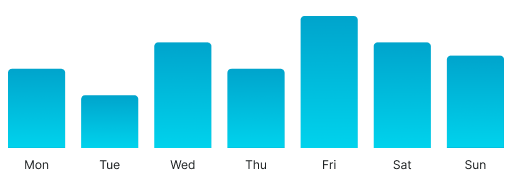
has-y-markers variant
Controls the visibility and styling of vertical axis markers that provide value reference points and grid structure for data comparison and interpretation.
- true
- false
Graph markers: variant
Controls the quantity and density of data markers within the nested graph component, determining how many marker points are displayed for data reference and grid structure.
- 3
- 7
- 12
- 30
X Axis markers: variant
Specifies the quantity and density of horizontal axis markers within the nested axis component, determining how many categorical or sequential reference points are displayed.
- 3
- 7
- 12
- 30
Area Chart
Properties that define the visual state and data presentation of area chart elements that represent continuous data through filled trend visualization.
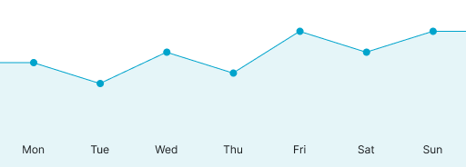

trend variant
Controls the overall direction and visual emphasis of the area chart trend line, determining the data progression presentation and analytical focus.
- increase
- decrease
has-y-markers variant
Controls the visibility and styling of vertical axis markers that provide value reference points and grid structure for data interpretation.
- true
- false
Graph type: variant
Specifies the visual presentation format of the nested graph component, determining whether linear or curved styling is applied for trend visualization.
- linear
- curved
Graph markers: variant
Controls the quantity and density of data point markers within the nested graph component, determining how many marker points are displayed for enhanced data point identification.
- 3
- 7
- 12
- 30
Graph has-dots: boolean
Controls the visibility of individual data point indicators within the nested graph component for precise value identification and data point emphasis.
- true
- false
X Axis markers: variant
Specifies the quantity and density of horizontal axis markers within the nested axis component, determining how many temporal or categorical reference points are displayed.
- 3
- 7
- 12
- 30
Gauge Chart
Properties that define the visual state and performance presentation of gauge chart elements that represent single metric values through circular indicators.


type variant
Controls the structural shape and coverage of the gauge chart, determining the visual presentation format used for metric display.
- true
- false
Graph weight: variant
Specifies the thickness and visual prominence of the gauge indicator within the nested graph component for metric emphasis and visual hierarchy.
- thin
- medium
- tick
Donut Chart
Properties that define the visual state and compositional presentation of donut chart elements that represent proportional data through segmented circular visualization.
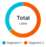
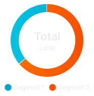
type variant
Controls the layout arrangement and legend positioning of the donut chart, determining the spatial organization used for data presentation.
- bottom-legend
- type-legend
Graph segment: variant
Controls the number of data segments within the nested graph component, determining how many segments are displayed in the donut chart for data categorization.
- 2
- 3
- 4
- 5
- 10
Circle weight: variant
Specifies the thickness and visual prominence of the donut ring within the nested circle component for proportional emphasis and visual clarity.
- xsmall
- small
- medium
- large
- xlarge