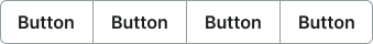
button-group
Collections of related buttons organized into cohesive sets, providing users with multiple related action options in a single component.
Configurable properties that control the appearance, behavior, and functionality of button group components.
Button Group Item
Properties that define the visual state and interactive behavior of individual button elements within grouped interface structures.

context variant
Controls the visual style and semantic meaning of the button based on its intended purpose and importance.
- default
- primary
size variant
Controls the dimensional scale and proportional relationships of the button component.
- large
- medium
- small
state variant
Controls the interactive state and visual feedback of the button based on user interaction.
- idle
- hover
- press
- disabled
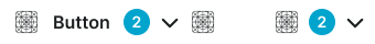
has-icon-start boolean
Controls the visibility of an icon element positioned before the button label.
- true
- false
icon-start-instance instance-swap
- has-icon-start:
- true
Specifies which icon component to display when icon-start property is enabled.
- Icon Placeholder
has-badge boolean
Controls the visibility of a badge element positioned after the button label for displaying counts or notifications.
- true
- false
is-dropdown boolean
Controls the visibility of a dropdown indicator that signals additional actions or options.
- true
- false
has-icon-end boolean
Controls the visibility of an icon element positioned after the button label.
- true
- false
icon-end-instance instance-swap
- has-icon-end:
- true
Specifies which icon component to display when icon-end property is enabled.
- Icon Placeholder
Button Group
Properties that define the visual state and layout organization of container elements that present collections of related buttons through unified treatment.

context variant
Controls the visual style and semantic meaning of the button group based on its intended purpose and importance within the interface hierarchy.
- default
- primary
layout variant
Controls the spatial arrangement and orientation of button elements within the group structure, determining horizontal or vertical organization patterns.
- horizontal
- vertical
Cart Button Group
Properties that define the visual state and functional behavior of specialized quantity control elements designed for e-commerce product management interactions.
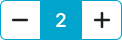

layout variant
Controls the spatial arrangement and orientation of quantity control elements within the cart button group structure for optimal space utilization.
- horizontal
- vertical
size variant
Controls the dimensional scale and proportional relationships of the cart button group component to optimize usability across different shopping interface contexts.
- large
- medium
- small