table
Structured data displays that organize information into rows and columns, enabling users to scan, sort, and analyze tabular data.
Configurable properties that control the appearance, behavior, and functionality of table components for structured data presentation and interactive tabular displays.
Table Data Cell
Properties that define the visual state and interactive behavior of individual data cell elements within table structures.


type variant
Controls the content presentation method and interactive capabilities of the data cell, determining the format and functionality available for data display.
- basic
- form
- button
- icon
- badge
- check
- custom
icon-instance instance-swap
- type:
- icon
Specifies which icon component to display when the data cell includes icon elements for visual representation and identification.
- Icon Placeholder
Table Head Cell
Properties that control the layout, functionality, and interactive behavior of table header elements for column organization and data operations.


checkbox variant
Controls the content type displayed within the header cell, determining whether text content or checkbox element is shown for column identification or selection capabilities.
- true
- false
filtering variant
Controls the filtering functionality and visual presentation within the header cell, determining the type of data filtering interface available for content refinement.
- true
- false
has-sorting boolean
- checkbox:
- false
Controls the visibility of sorting functionality within the header cell, enabling users to organize data by column values.
- true
- false
has-input boolean
- checkbox || filtering:
- true
Controls the visibility of input elements within the header cell for filtering and search capabilities.
- true
- false
Table Row
Properties that define the visual state and interactive behavior of horizontal container elements that organize related data across columns.


type variant
Controls the presentation state and functional capabilities of the row, determining visual emphasis, interaction feedback, and operational context.
- header
- odd
- even
- hover
- active
- edit
Table Container
Properties that control the overall structure, layout behavior, and supplementary functionality of table wrapper elements.
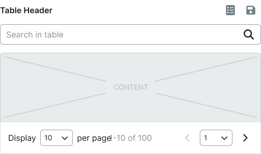
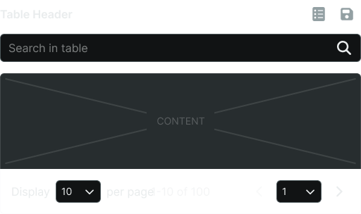
type variant
Controls the structural configuration of the table container, determining scrolling behavior and layout constraints for tabular content presentation.
- basic
- sticky
header boolean
Controls the visibility of table header elements that provide column identification and organizational structure.
- true
- false
search boolean
Controls the visibility of search functionality that enables users to filter and locate specific data within the table.
- true
- false
pager boolean
Controls the visibility of pagination elements that manage navigation through large datasets and content organization.
- true
- false
table-instance instance-swap
Specifies which table component structure to display within the container, allowing for flexible table composition and layout management.