pagination
Navigation controls that divide content across multiple pages, allowing users to browse through large datasets or content collections sequentially.
Technical specifications and design system values that define the visual and structural properties of pagination components. These specifications ensure consistent implementation across design tools and development environments.
Legend:
- Brackets (
[]) denote a component variant placeholder. - Full emphasis indicates a value specific to that variant.
- Dimmed indicates a value unchanged from the default variant.
Page Number
Specifications for individual numeric page selection elements including measurements, colors, typography, and interactive styling attributes. These values define the core appearance and state-dependent properties for clickable page number implementations.


1
Page Number
- state:
- idle, hover, disabled
- verticalPadding:
- space.unit.4
- horizontalPadding:
- space.unit.8
- fill:
- color.context.default.bg-[state]
- borderRadius:
- borderRadius.pagination.button
- state:
- active
- verticalPadding:
- space.unit.4
- horizontalPadding:
- space.unit.8
- fill:
- color.context.primary.bg-solid
- borderRadius:
- borderRadius.pagination.button
2
Page Text
- state:
- idle, hover, disabled
- fill:
- color.button.default.fg-[state]
- typography:
- font.text.medium.strong
- state:
- active
- fill:
- color.button.primary.fg-solid
- typography:
- font.text.medium.strong
Page Arrow
Specifications for directional navigation arrow elements including measurements, colors, iconography, and interactive styling attributes. These values define the core appearance and state-dependent properties for previous/next navigation implementations.
1
Page Arrow
- verticalPadding:
- space.unit.6
- horizontalPadding:
- space.unit.6
- fill:
- color.context.default.bg-[state]
- borderRadius:
- borderRadius.pagination.button
2
Page Icon
- height:
- size.unit.20
- width:
- size.unit.20
- fill:
- color.context.default.fg-[state]
Simple Pagination
Specifications for numbered page navigation elements including measurements, colors, typography, and interactive styling attributes. These values define the core appearance and behavior properties for standard pagination implementations.
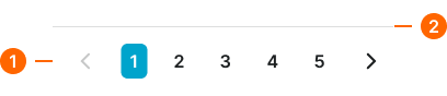
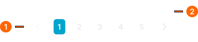
1
Simple Paginator
- verticalPadding:
- space.context.medium
- horizontalPadding:
- space.context.medium
- itemSpacing:
- space.context.2xsmall
2
Separator
- variant:
- default
- height:
- size.asset.separator
- fill:
- color.context.default.border-subtle
Advanced Pagination
Specifications for enhanced pagination elements including measurements, colors, typography, and comprehensive control styling attributes. These values define the appearance and functionality properties for feature-rich pagination interfaces.
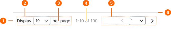
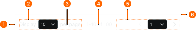
1
Advanced Paginator
- verticalPadding:
- space.context.medium
- horizontalPadding:
- space.context.medium
- itemSpacing:
- space.context.medium
2
Per Page Frame
- size:
- large
- itemSpacing:
- space.context.xsmall
- size:
- small
- itemSpacing:
- space.context.xsmall
3
Per Page Text
- fill:
- color.context.default.fg-main
- typography:
- font.text.medium.normal
4
Summary Text
- fill:
- color.context.default.fg-subtle
- typography:
- font.text.medium.normal
5
Page Nav Frame
- size:
- large
- itemSpacing:
- space.context.xsmall
- size:
- small
- itemSpacing:
- space.context.xsmall
6
Separator
- height:
- size.asset.separator
- fill:
- color.context.default.border-subtle
Dot Pagination
Specifications for minimal dot-based navigation elements including measurements, colors, position indicators, and subtle interaction styling attributes. These values define the appearance and feedback properties for sequential content navigation.
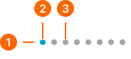
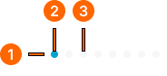
1
Dot Paginator
- verticalPadding:
- space.context.xsmall
- horizontalPadding:
- space.context.xsmall
- itemSpacing:
- space.pagination.dot-gap
1
Page Dot
- active:
- true
- height:
- size.pagination.dot-active-h
- width:
- size.pagination.dot-active-w
- fill:
- color.context.default.icon-main
- borderRadius:
- borderRadius.pagination.dot
- active:
- false
- height:
- size.pagination.dot-idle-h
- width:
- size.pagination.dot-idle-w
- fill:
- color.context.default.icon-subtle
- borderRadius:
- borderRadius.pagination.dot