modal
Dialog components that overlay the main content, focusing user attention on critical information or tasks that require interaction before returning to the main interface.
Technical specifications and design system values that define the visual and structural properties of modal components. These specifications ensure consistent implementation across design tools and development environments for content presentation and interactive workflow interfaces.
Legend:
- Brackets (
[]) denote a component variant placeholder. - Full emphasis indicates a value specific to that variant.
- Dimmed indicates a value unchanged from the default variant.
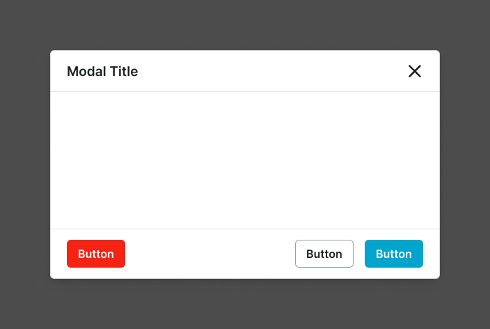
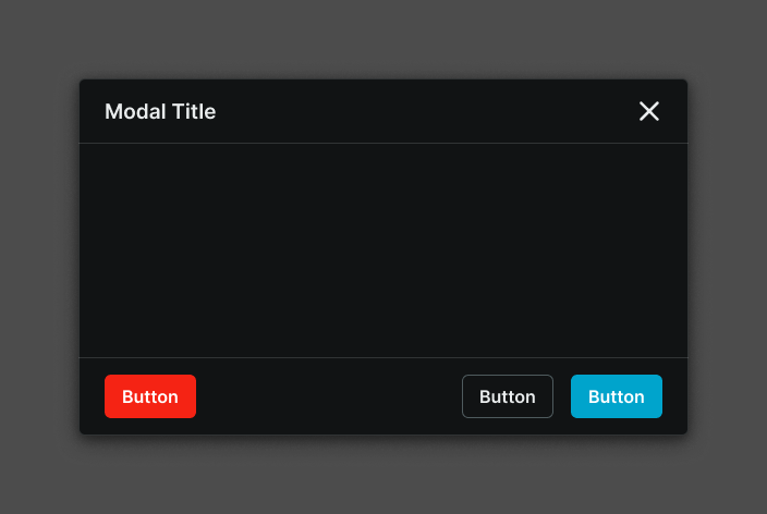
Modal Window
Specifications for overlay dialog elements including measurements, colors, typography, and styling attributes. These values define the core appearance and behavior properties for each modal window variant requiring focused content presentation and user interaction.
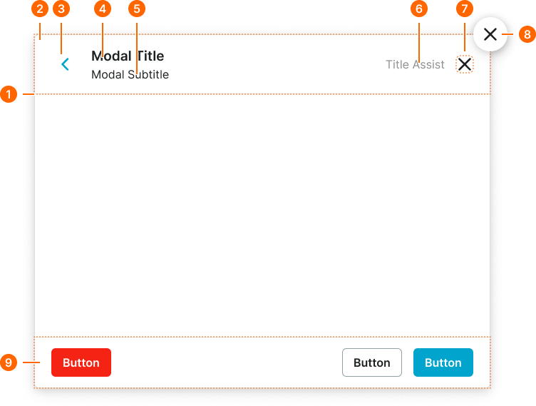
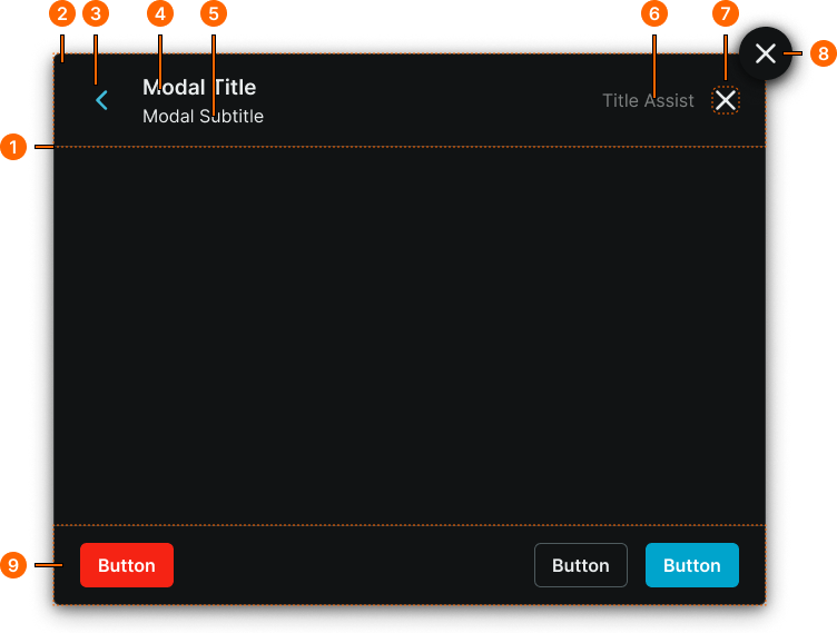
1
Modal Window
- fill:
- color.context.default.bg-main
- borderColor:
- color.context.default.border-subtle
- borderRadius:
- borderRadius.modal.main
- borderWidth:
- borderWidth.context.medium
- boxShadow:
- shadow.modal.main
2
Modal Header
Local component
- verticalPadding:
- space.context.medium
- horizontalPadding:
- space.modal.medium-padding-x
- itemSpacing:
- space.context.medium
3
Back Button
Link Icon-Button component with custom sizing. See cx.comp.button-link for more.
- height:
- size.base.28
- width:
- size.base.28
4
Modal Title
- fill:
- color.context.default.fg-main
- typography:
- font.modal.medium-title
5
Modal Subtitle
- fill:
- color.context.default.fg-main
- typography:
- font.modal.medium-subtitle
6
Modal Assist
- fill:
- color.context.default.fg-subtle
- typography:
- font.text.medium.normal
7
Close Button
Close Button component. See cx.comp.close-button for more.
8
Floating Button
Floating Icon-Button component. See cx.comp.floating-button for more.
9
Modal Footer
Local component
- verticalPadding:
- space.context.medium
- horizontalPadding:
- space.modal.medium-padding-x
- itemSpacing:
- space.context.medium
Modal Screen
Specifications for the full-interface modal screen backdrop and window sizing including measurements, colors, and layout attributes. These values define the appearance and behavior properties for each modal screen variant with size-specific spacing and dimension specifications.
1
Modal Screen
- variant:
- xlarge, large, medium
- verticalPadding:
- space.base.72
- horizontalPadding:
- space.base.72
- fill:
- color.context.default.dim-main
- variant:
- small
- verticalPadding:
- space.base.32
- horizontalPadding:
- space.base.32
- fill:
- color.context.default.dim-main
- variant:
- full-large, full-small
- verticalPadding:
- space.base.0
- horizontalPadding:
- space.base.0
- fill:
- color.context.default.dim-main
2
Modal Window
- size:
- xlarge, large, medium
- width:
- size.modal.window-[size]-w
- height:
- size.modal.window-[size]-h
- size:
- small
- width:
- fill
- height:
- hug
- size:
- full-large, full-small
- width:
- fill
- height:
- fill