modal
Dialog components that overlay the main content, focusing user attention on critical information or tasks that require interaction before returning to the main interface.
Configurable properties that control the appearance, behavior, and functionality of modal components for content presentation and interactive workflow interfaces.
Modal Window
Properties that define the visual state and interactive behavior of modal dialog elements that display focused content, detailed information, and interactive workflows requiring user attention.
size variant
Controls the layout dimensions and content presentation of the modal window based on screen size and device capabilities.
- large
- small
is-full-screen variant
Controls the display behavior and screen coverage of the modal window, determining the presentation approach and spatial relationship with the main application content.
- true
- false
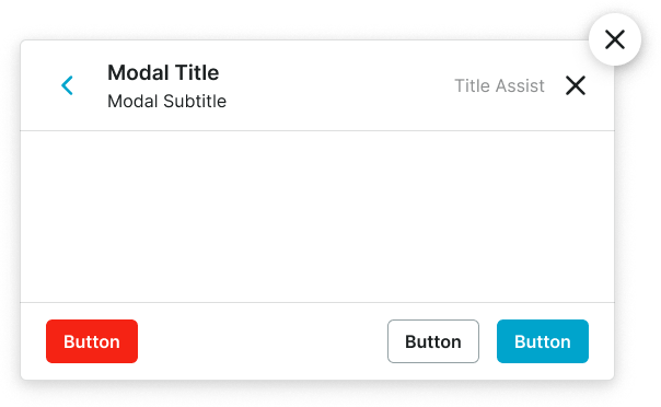
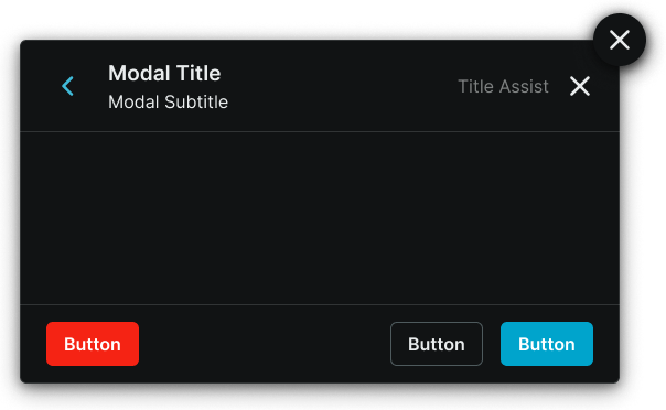
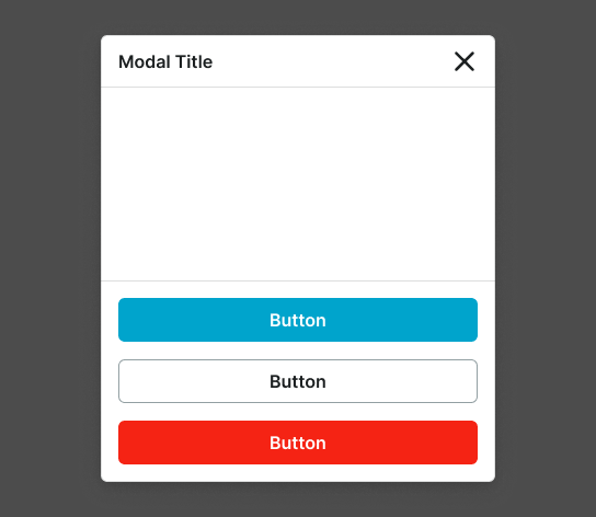
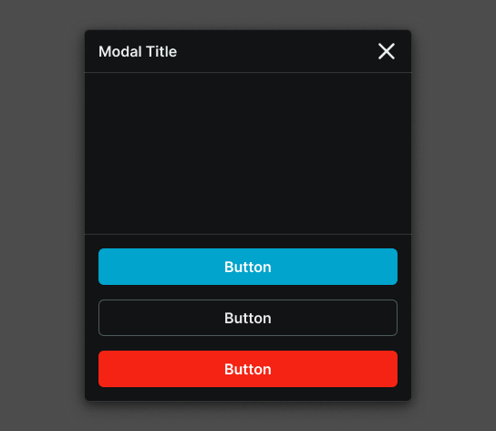
has-header boolean
Controls the visibility of a header section that provides modal identification, navigation, and primary action elements.
- true
- false
has-footer boolean
Controls the visibility of a footer section that contains action buttons and supplementary controls for modal interaction.
- true
- false
has-scrollbar boolean
Controls the visibility of scrolling functionality within the modal content area for managing overflow content.
- true
- false
has-floating-close boolean
Controls the visibility of a floating close action element that allows users to dismiss the modal when no header is present.
- true
- false
modal-content slot
Allows you to freely add and arrange content directly inside a modal window without detaching it.
header -> has-back-button boolean
- has-header:
- true
Controls the visibility of a back navigation element within the modal header for multi-step workflows and hierarchical navigation.
- true
- false
header -> has-subtitle boolean
- has-header:
- true
Controls the visibility of subtitle text within the modal header for additional context and information hierarchy.
- true
- false
header -> has-assist boolean
- has-header:
- true
Controls the visibility of assistance elements within the modal header that provide help, guidance, or supplementary functionality.
- true
- false
header -> has-close boolean
- has-header:
- true
Controls the visibility of a close action element within the modal header for direct modal dismissal access.
- true
- false
footer -> has-2nd-action boolean
- has-footer:
- true
Controls the visibility of a secondary action element within the modal footer when multiple response options are needed.
- true
- false
footer -> has-3rd-action boolean
- has-footer:
- true
Controls the visibility of a tertiary action element within the modal footer for complex scenarios requiring multiple user options.
- true
- false
Modal Screen
Properties that control the layout and content structure of fullscreen overlay elements that provide the foundational backdrop and positioning framework for modal presentations.
size variant
Controls the layout dimensions and content organization of the modal screen based on screen size, device orientation capabilities, and content complexity requirements.
- xlarge
- large
- medium
- small
- fullscreen-large
- fullscreen-small