notification
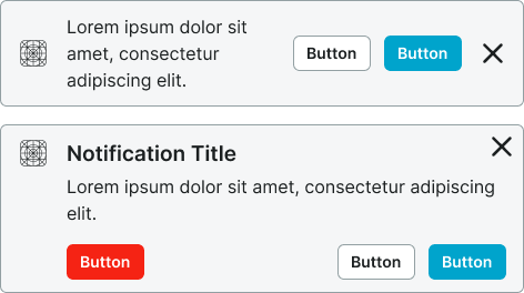
Temporary messages that inform users about system events, updates, or changes, typically appearing as toast messages or banner alerts.
Configurable properties that control the appearance, behavior, and functionality of notification components for informational messaging and user feedback interfaces.
Notifications
Properties that define the visual style and interactive behavior of standard notification elements.
context variant
Controls the visual style and semantic meaning of the notification based on message type and urgency level.
- default
- alternate
- primary
- secondary
- neutral
- danger
- success
- warning
- info
- black
- white
style variant
Controls the visual treatment and background presentation of the notification element.
- basic
- solid
dismissible boolean
Controls the visibility of a dismiss action that allows users to close the notification.
- true
- false
has-icon boolean
Controls the visibility of an icon element that provides visual context for the notification message.
- true
- false
icon-instance instance-swap
- has-icon:
- true
Specifies which icon component to display when has-icon property is enabled.
- Icon Placeholder
has-slot boolean
- type:
- rich
Controls the visibility of a custom content slot for additional elements within the notification.
- true
- false
slot slot
- has-slot:
- true
Allows to freely add and arrange content directly inside a notification without detaching it.
has-actions boolean
Controls the visibility of action elements that provide interactive response options within the notification.
- true
- false
has-2nd-action boolean
- has-actions:
- true
Controls the visibility of a secondary action element when multiple response options are needed.
- true
- false
has-3rd-action boolean
- has-actions:
- true
Controls the visibility of a tertiary action element for complex notification scenarios requiring multiple user options.
- true
- false