notification
Temporary messages that inform users about system events, updates, or changes, typically appearing as toast messages or banner alerts.
Technical specifications and design system values that define the visual and structural properties of notification components. These specifications ensure consistent implementation across design tools and development environments for system messaging and status communication interfaces.
Legend:
- Brackets (
[]) denote a component variant placeholder. - Full emphasis indicates a value specific to that variant.
- Dimmed indicates a value unchanged from the default variant.
Notification
Specifications for basic notification elements including measurements, colors, typography, and styling attributes. These values define the core appearance and behavior properties for each notification variant with essential messaging capabilities.
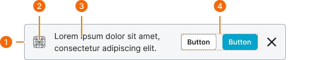
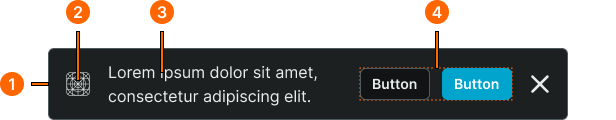
1
Notification
- style:
- basic
- verticalPadding:
- space.notification.padding-y
- horizontalPadding:
- space.notification.padding-x
- itemSpacing:
- space.notification.gap
- fill:
- color.context.[context].bg-even
- borderColor:
- color.context.[context].border-main
- borderRadius:
- borderRadius.notification
- borderWidth:
- borderWidth.notification
- style:
- solid
- verticalPadding:
- space.notification.padding-y
- horizontalPadding:
- space.notification.padding-x
- itemSpacing:
- space.notification.gap
- fill:
- color.context.[context].bg-solid
- borderColor:
- color.context.[context].transparent-color
- borderRadius:
- borderRadius.notification
- borderWidth:
- borderWidth.notification
2
Icon
- style:
- basic
- height:
- size.notification.icon
- width:
- size.notification.icon
- fill:
- color.context.[context].fg-main
- style:
- solid
- height:
- size.notification.icon
- width:
- size.notification.icon
- fill:
- color.context.[context].fg-solid
3
Notification Text
- style:
- basic
- fill:
- color.context.[context].fg-main
- typography:
- font.notification.message
- style:
- solid
- fill:
- color.context.[context].fg-solid
- typography:
- font.notification.message
4
Actions Frame
- itemSpacing:
- space.context.small
Rich Notification
Specifications for enhanced notification elements including measurements, colors, typography, and styling attributes. These values define the comprehensive appearance and behavior properties for each rich notification variant with advanced messaging and interactive capabilities.
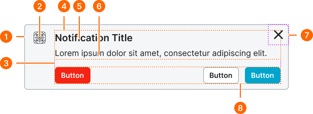
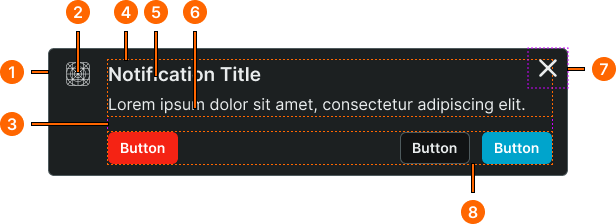
1
Notification
- style:
- basic
- verticalPadding:
- space.notification.padding-y
- horizontalPadding:
- space.notification.padding-x
- itemSpacing:
- space.notification.gap
- fill:
- color.context.[context].bg-even
- borderColor:
- color.context.[context].border-main
- borderRadius:
- borderRadius.notification
- borderWidth:
- borderWidth.notification
- style:
- solid
- verticalPadding:
- space.context.small
- horizontalPadding:
- space.context.medium
- itemSpacing:
- space.context.medium
- fill:
- color.context.[context].bg-solid
- borderColor:
- color.context.[context].transparent-color
- borderRadius:
- borderRadius.notification
- borderWidth:
- borderWidth.notification
2
Icon
- style:
- basic
- height:
- size.notification.icon
- width:
- size.notification.icon
- fill:
- color.context.[context].fg-main
- style:
- solid
- height:
- size.notification.icon
- width:
- size.notification.icon
- fill:
- color.context.[context].fg-solid
3
Content Frame
- itemSpacing:
- space.context.medium
4
Text Frame
- itemSpacing:
- space.context.2xsmall
5
Notification Title
- style:
- basic
- fill:
- color.context.[context].fg-main
- typography:
- font.notification.title
- style:
- solid
- fill:
- color.context.[context].fg-solid
- typography:
- font.notification.title
6
Notification Text
- style:
- basic
- fill:
- color.context.[context].fg-main
- typography:
- font.notification.message
- style:
- solid
- fill:
- color.context.[context].fg-solid
- typography:
- font.notification.message
7
Close Frame
- spacing:
- space.context.xsmall
9
Actions Frame
- itemSpacing:
- space.context.small