tooltip
Small informational popups that appear on hover or focus, providing additional context, help text, or descriptions for UI elements.
On this page
This documentation is a work in progress and may contain incomplete or outdated information. If you have any feedback or suggestions, please open an issue on GitHub.
Technical specifications and design system values that define the visual and structural properties of tooltip components. These specifications ensure consistent implementation across design tools and development environments for contextual information and guidance interfaces.
Legend:
- Brackets (
[]) denote a component variant placeholder. - Full emphasis indicates a value specific to that variant.
- Dimmed indicates a value unchanged from the default variant.
Tooltips
Specifications for contextual overlay elements including measurements, colors, typography, and styling attributes. These values define the core appearance and behavior properties for each tooltip variant with informational and guidance capabilities.
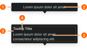
1
Tooltip
- padding-y:
- space.context.xsmall
- padding-x:
- space.context.xsmall
- gap:
- space.context.xsmall
- color.background:
- color.context.[context].bg-inverse
- borderRadius:
- borderRadius.tooltip.main
- boxShadow:
- shadow.common.popover
2
Tooltip Text
- color.foreground:
- color.context.[context].fg-inverse
- typography:
- font.text.small.normal
3
Text Frame
- gap:
- space.context.2xsmall
4
Tooltip Title
- color.foreground:
- color.context.[context].fg-inverse
- typography:
- font.text.small.strong