tooltip
Small informational popups that appear on hover or focus, providing additional context, help text, or descriptions for UI elements.
Configurable properties that control the appearance, behavior, and functionality of tooltip components for contextual information and guidance interfaces.
Tooltips
Properties that define the visual state and interactive behavior of contextual overlay elements with informational and guidance capabilities.
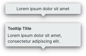
context variant
Controls the visual style and semantic meaning of the tooltip based on information type, importance, and intended purpose.
- default
- alternate
- black
- white
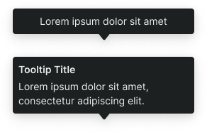
rich variant
Controls the content structure and layout complexity of the tooltip, determining the information hierarchy and visual organization.
- basic
- rich
has-title boolean
- rich:
- true
Controls the visibility of a title element that provides primary identification and context for the tooltip content.
- true
- false
has-slot boolean
- rich:
- true
Controls the visibility of a custom content slot for additional elements or media within the tooltip.
- true
- false
slot-instance instance-swap
- has-slot:
- true
Allows to freely add and arrange content directly inside a tooltip without detaching it.
background -> position variant
Controls the positioning and directional orientation of the tooltip bubble arrow, determining the visual connection point between the tooltip and its triggering element.
- bottom
- bottom-left
- bottom-right
- left
- left-bottom
- left-top
- right
- right-bottom
- right-top
- top
- top-left
- top-right