form-regular
Text input fields that enable users to enter and edit data such as names, emails, passwords, or other textual information.
Technical specifications and design system values that define the visual and structural properties of form regular components. These specifications ensure consistent implementation across design tools and development environments.
Legend:
- Brackets (
[]) denote a component variant placeholder. - Full emphasis indicates a value specific to that variant.
- Dimmed indicates a value unchanged from the default variant.
Form Input Component
Specifications for individual input elements including measurements, colors, typography, and styling attributes. These values define the core appearance and behavior properties for each input variant.
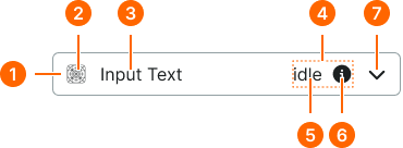
1
Regular Form Input
- verticalPadding:
- space.form-input.[size]-padding-y
- horizontalPadding:
- space.form-input.[size]-padding-x
- itemSpacing:
- space.form-input.[size]-gap
- fill:
- color.form-input.[state].bg-regular
- borderColor:
- color.form-input.[state].border
- borderRadius:
- borderRadius.form-input.[size]
- borderWidth:
- borderWidth.form-input.regular
2
Icon
- height:
- size.form-input.[size]-icon
- width:
- size.form-input.[size]-icon
- fill:
- color.form-input.[state].fg-active
3
Input Text
- fill:
- color.form-input.[state].fg-[active|inactive]
- typography:
- font.form-input.[size]-text
4
Input Help
- itemSpacing:
- space.unit.8
5
Help Icon
- fill:
- color.form-input.[state].help
- typography:
- font.assist.[size]
6
Help Icon
- height:
- size.form-input.[size]-icon
- width:
- size.form-input.[size]-icon
- fill:
- color.form-input.[state].help
7
Caret
- height:
- size.form-input.[size]-caret
- width:
- size.form-input.[size]-caret
- fill:
- color.form-input.[state].caret
Form Field Component
Specifications for complete form field layouts including spacing relationships and component composition guidelines. These specifications ensure proper alignment and hierarchy across different form field configurations.
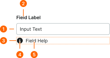
1
Regular Form Field
- itemSpacing:
- space.context.xsmall
2
Field Label Text
- fill:
- color.context.default.fg-main
- typography:
- font.text.medium.strong
3
Help Frame
- itemSpacing:
- space.context.xsmall
4
Help Icon
- height:
- size.icon.glyph.small
- width:
- size.icon.glyph.small
- fill:
- color.form-input.[state].help
5
Help Text
- fill:
- color.form-input.[state].help
- typography:
- font.text.small.normal