form-regular
Text input fields that enable users to enter and edit data such as names, emails, passwords, or other textual information.
Configurable properties that control the appearance, behavior, and functionality of form input components for data entry and user input interfaces.
Form Input
Properties that define the visual state and interactive behavior of individual input field elements.


type variant
Controls the input method and content format of the form input element based on expected data type requirements.
- text
- select
- date
- textarea
size variant
Controls the dimensional scale and proportional relationships of the form input component.
- small
- medium
- large
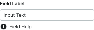
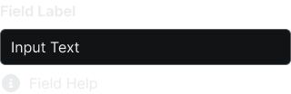
state variant
Controls the interactive state and visual feedback of the form input based on user interaction and validation status.
- idle
- disabled
- focus
- error
- success
active boolean
Controls whether the input appears populated with content or empty.
- true
- false
icon boolean
Controls the visibility of an icon element positioned before the input text.
- true
- false
icon-instance instance-swap
- icon:
- true
Specifies which icon component to display when icon property is enabled.
- Icon Placeholder
help boolean
Controls the visibility of assistance text or elements positioned after the input.
- true
- false
scrollbar boolean
- type:
- textarea
Controls the visibility of scrollbar interface for textarea-type form inputs.
- true
- false
Form Field
Properties that control the layout and content structure of complete form field elements.
type variant
Controls the input component type used within the form field structure.
- text
- select
- textarea
label boolean
Controls the visibility of descriptive text positioned above the input component.
- true
- false
help boolean
Controls the visibility of instructional or validation text positioned below the input component.
- true
- false
dropdown boolean
- type:
- select
Controls the visibility of selection menu interface for select-type form fields.
- true
- false