form-outline
Outlined input field styling with border emphasis and integrated label positioning, providing strong visual definition and material design pattern support.
Technical specifications and design system values that define the visual and structural properties of outlined form components. These specifications ensure consistent implementation across design tools and development environments.
Legend:
- Brackets (
[]) denote a component variant placeholder. - Full emphasis indicates a value specific to that variant.
- Dimmed indicates a value unchanged from the default variant.
Form Input
Specifications for outlined input elements including measurements, colors, typography, and styling attributes. These values define the core appearance and border emphasis for outlined form variants.

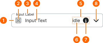
1
Outline Form Input
Outline form inputs lack actual padding. The spacing is provided by sizing tokens used on border partials.
- verticalPadding:
- size.unit.12
- horizontalPadding:
- size.unit.12
- itemSpacing:
- space.form-input.[size]-gap
- borderColor:
- color.form-input.[state].border
- borderRadius:
- borderRadius.form-input.[size]
- borderWidth:
- borderWidth.form-input.regular
2
Icon
- height:
- size.form-input.medium-icon
- width:
- size.form-input.medium-icon
- fill:
- color.form-input.[state].fg-active
3
Label Text
- fill:
- color.form-input.[state].help
- typography:
- font.form-input.floating-label
4
Input Text
- fill:
- color.form-input.idle.fg-[active|inactive]
- typography:
- font.form-input.floating-text
5
Assist Frame
- verticalPadding:
- space.unit.8
- itemSpacing:
- space.unit.8
6
Assist Text
- fill:
- color.form-input.idle.help
- typography:
- font.assist.medium
7
Assist Icon
- height:
- size.form-input.medium-icon
- width:
- size.form-input.medium-icon
- fill:
- color.form-input.default.[state].help
8
Caret Icon
- height:
- size.form-input.medium-caret
- width:
- size.form-input.medium-caret
- fill:
- color.form-input.default.[state].caret
Form Field
Specifications for composite field elements including labels, help text, and form input combinations. These values define the structural and informational properties for each field variant.
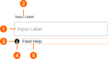

1
Floating Form Field
- itemSpacing:
- space.context.xsmall
2
Field Label Text
- fill:
- color.context.default.fg-main
- typography:
- font.text.medium.strong
3
Help Frame
- itemSpacing:
- space.context.xsmall
4
Help Icon
- height:
- size.icon.glyph.small
- width:
- size.icon.glyph.small
- fill:
- color.form-input.[state].help
5
Help Text
- fill:
- color.form-input.[state].help
- typography:
- font.text.small.normal