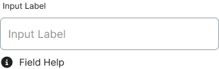
form-outline
Outlined input field styling with border emphasis and integrated label positioning, providing strong visual definition and material design pattern support.
Configurable properties that control the appearance, behavior, and functionality of form outline input components for data entry interfaces with bordered visual definition.
Form Input
Properties that define the visual state and interactive behavior of individual outlined input field elements.


type variant
Controls the input method and content format of the form input element based on expected data type requirements.
- text
- select
- date
- textarea
size variant
Controls the dimensional scale and proportional relationships of the form input component.
- small
- medium
- large
state variant
Controls the interactive state and visual feedback of the form input based on user interaction and validation status.
- idle
- disabled
- focus
- error
- success
active variant
Controls the activity state and visual treatment of the form input based on user engagement and interaction status.
- active
- inactive
icon boolean
Controls the visibility of an icon element positioned within the form input for visual context and input type indication.
- true
- false
icon-instance instance-swap
- icon:
- true
Specifies which icon component to display when icon property is enabled.
- Icon Placeholder
help boolean
Controls the visibility of helper text that provides additional instructions or context for the form input.
- true
- false
scrollbar boolean
Controls the visibility of a scrollbar element for managing overflow content within the form input.
- true
- false
Form Field
Properties that define the structure and configuration of the form field container that wraps outlined input elements with integrated labels and supporting content.

type variant
Controls the field structure and layout organization of the form field container based on input type requirements.
- text
- select
- textarea
label boolean
Controls the visibility of descriptive text positioned above the input component.
- true
- false
help boolean
Controls the visibility of helper text within the form field that provides additional instructions or context.
- true
- false
dropdown boolean
- type:
- select
Controls the visibility of a dropdown indicator that signals available selection options within the form field.
- true
- false