progress
Visual indicators that show the completion status of tasks, loading states, or multi-step processes.
Technical specifications and measurements for progress components that ensure consistent implementation and precise visual rendering across different platforms and interface contexts.
Legend:
- Brackets (
[]) denote a component variant placeholder. - Full emphasis indicates a value specific to that variant.
- Dimmed indicates a value unchanged from the default variant.
Progress Bar
Linear progress indication elements that display task completion through visual fill representation with precise dimensional and spacing specifications for consistent progress visualization.


1
Progress Bar
- fill:
- color.context.default.dim-slight
- borderRadius:
- borderRadius.context.xsmall
2
Loaded
- fill:
- color.context.default.cue-main
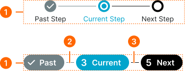
Thumb Progress Step
Individual step milestone elements that display specific completion states within progress sequences with precise dimensional and spacing specifications for consistent step visualization.
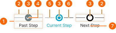
1
Thumb Progress Step
- itemSpacing:
- space.context.2xsmall
2
Mark Frame
- itemSpacing:
- space.context.2xsmall
3
Step Mark
- height:
- size.unit.24
- width:
- size.unit.24
- fill:
- color.progress.bg-[state]
4
Icon
Past variant only
- height:
- size.icon.glyph.small
- width:
- size.icon.glyph.small
- fill:
- color.progress.fg-[state]
5
Left Line
- state:
- past, current
- height:
- size.asset.separator
- fill:
- color.progress.border-past
- state:
- next
- height:
- size.asset.separator
- fill:
- color.progress.border-next
6
Right Line
- state:
- past
- height:
- size.asset.separator
- fill:
- color.progress.border-past
- state:
- current, next
- height:
- size.asset.separator
- fill:
- color.progress.border-next
7
Label Text
- state:
- past, next
- fill:
- color.context.default.fg-main
- typography:
- font.text.small.normal
- state:
- current
- fill:
- color.context.primary.fg-main
- typography:
- font.text.small.normal
Chip Progress Step
Individual step milestone elements that display specific completion states within progress sequences with precise dimensional and spacing specifications for consistent step visualization.
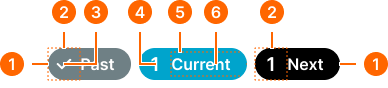
1
Chip Progress Step
- itemSpacing:
- space.progress.common.chip-main-gap
- fill:
- color.progress.bg-[state]
- borderRadius:
- borderRadius.context.round-32
2
Mark Frame
- height:
- size.unit.32
- width:
- size.unit.32
3
Mark Icon
- height:
- size.icon.glyph.small
- width:
- size.icon.glyph.small
- fill:
- color.progress.fg-[state]
4
Mark Number
- fill:
- color.progress.fg-[state]
- typography:
- font.text.large.strong
5
Label Frame
- paddingRight:
- space.unit.16
6
Label Text
- fill:
- color.progress.fg-[state]
- typography:
- font.text.medium.strong
Progress Flow
Complete progress tracking systems that combine multiple step elements with precise dimensional and spacing specifications for consistent flow visualization.
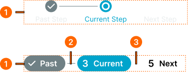
1
Progress Flow
- type:
- thumb
- itemSpacing:
- space.context.zero
- type:
- chip
- itemSpacing:
- space.context.2xsmall
2
Past Line
- height:
- size.asset.separator
- width:
- size.unit.16
- fill:
- color.progress.border-past
3
Next Line
- height:
- size.asset.separator
- width:
- size.unit.16
- fill:
- color.progress.border-next
Loading Indicator
Dynamic progress indication elements that display indeterminate loading states with precise dimensional and spacing specifications for consistent loading visualization.
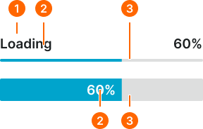
1
Loading Indicator
- variant:
- default
- itemSpacing:
- space.context.xsmall
2
Label
- label:
- external
- fill:
- color.context.default.fg-main
- typography:
- font.text.large.strong
- label:
- internal
- fill:
- color.context.primary.contrast-color
- typography:
- font.text.large.strong
3
Progress Bar
- label:
- external (thin)
- minHeight:
- size.unit.4
- label:
- external (tall)
- minHeight:
- size.unit.32