mobile-alert
Mobile-optimized notification components designed specifically for smaller screens, displaying important messages and alerts on mobile devices.
Technical specifications and design system values that define the visual and structural properties of mobile alert components. These specifications ensure consistent implementation across design tools and development environments.
Legend:
- Brackets (
[]) denote a component variant placeholder. - Full emphasis indicates a value specific to that variant.
- Dimmed indicates a value unchanged from the default variant.
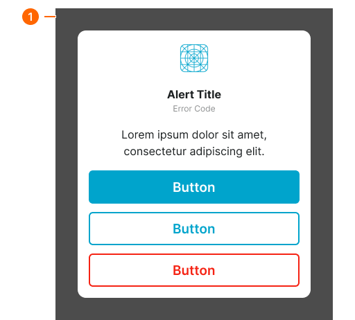
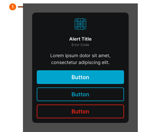
Mobile Alert Dialog
Specifications for the mobile alert window container and its internal elements including layout structure, colors, typography, and sizing attributes that define the appearance and content arrangement of alert notifications on mobile devices.
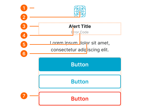
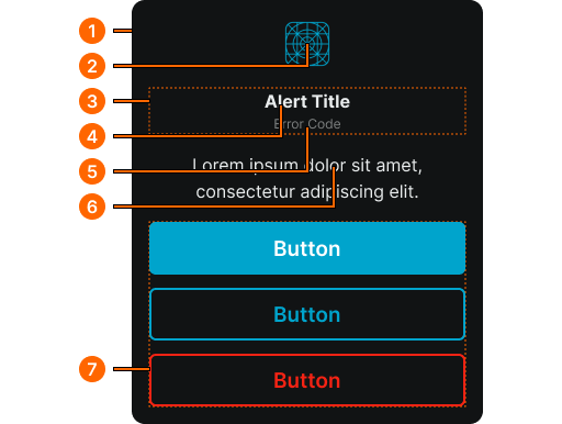
1
Mobile Alert Window
- verticalPadding:
- space.context.medium
- horizontalPadding:
- space.context.medium
- itemSpacing:
- space.context.medium
- fill:
- color.context.default.bg-main
- borderRadius:
- borderRadius.context.xlarge
2
Alert Icon
- height:
- size.icon.glyph.4xlarge
- width:
- size.icon.glyph.4xlarge
- fill:
- color.context.default.icon-main
3
Title Frame
- itemSpacing:
- none
4
Alert Title
- fill:
- color.context.default.fg-main
- typography:
- font.text.xsmall.normal
5
Error Code
- fill:
- color.context.default.fg-subtle
- typography:
- font.text.xsmall.normal
6
Alert Body
- fill:
- color.context.default.fg-main
- typography:
- font.text.medium.normal
7
Actions Frame
- itemSpacing:
- space.context.small
Mobile Alert Screen
Specifications for the full-screen mobile alert backdrop that overlays the current screen content when displaying an alert notification to users.