message
Contextual feedback components that communicate information, success confirmations, warnings, or errors to users in response to their actions.
Technical specifications and design system values that define the visual and structural properties of message components. These specifications ensure consistent implementation across design tools and development environments for messaging and conversational interface contexts.
Legend:
- Brackets (
[]) denote a component variant placeholder. - Full emphasis indicates a value specific to that variant.
- Dimmed indicates a value unchanged from the default variant.
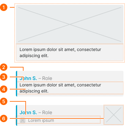
Chat Message
Specifications for individual message elements including measurements, colors, typography, and styling attributes. These values define the conversational content presentation and behavior properties for each message variant with received, sent, and group message capabilities.
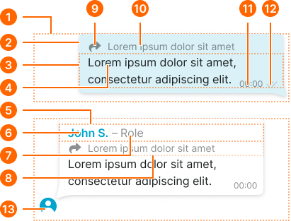
1
Chat Message
Container row for message bubble.
- type:
- group
- is-final:
- true
- paddingRight:
- space.base.36
- paddingBottom:
- space.base.36
- paddingLeft:
- space.base.36
- type:
- group
- is-final:
- false
- paddingRight:
- space.base.36
- paddingBottom:
- space.base.36
- paddingLeft:
- space.base.8
- type:
- received
- is-final:
- true
- paddingRight:
- space.base.64
- paddingBottom:
- space.base.12
- paddingLeft:
- space.base.8
- type:
- received
- is-final:
- false
- paddingRight:
- space.base.64
- paddingBottom:
- space.base.8
- paddingLeft:
- space.base.8
- type:
- sent
- is-final:
- true
- paddingRight:
- space.base.8
- paddingBottom:
- space.base.12
- paddingLeft:
- space.base.64
- type:
- sent
- is-final:
- false
- paddingRight:
- space.base.8
- paddingBottom:
- space.base.8
- paddingLeft:
- space.base.64
2
Content Frame
- type:
- received, group
- verticalPadding:
- space.base.8
- fill:
- color.message.bg-received
- borderRadius:
- borderRadius.context.medium
- boxShadow:
- shadow.message.main
- type:
- sent
- verticalPadding:
- space.base.8
- fill:
- color.message.bg-sent
- borderRadius:
- borderRadius.context.medium
- boxShadow:
- shadow.message.main
3
Message Frame
- horizontalPadding:
- space.base.12
4
Message Text
- fill:
- color.context.default.fg-main
- typography:
- font.text.medium.normal
5
Sender Frame
- horizontalPadding:
- space.base.12
- itemSpacing:
- space.context.2xsmall
6
Sender Name
- fill:
- color.context.default.icon-main
- typography:
- font.text.medium.strong
7
Sender Role
- fill:
- color.message.fg-received
- typography:
- font.text.medium.normal
- opacity:
- opacity.context.fg-subtle
8
Shared Frame
- horizontalPadding:
- space.base.12
- itemSpacing:
- space.base.8
- opacity:
- opacity.context.fg-subtle
9
Shared Icon
- type:
- received, group
- width:
- size.icon.glyph.small
- height:
- size.icon.glyph.small
- fill:
- color.message.fg-received
- type:
- sent
- width:
- size.icon.glyph.small
- height:
- size.icon.glyph.small
- fill:
- color.message.fg-sent
10
Shared Text
- type:
- received, group
- fill:
- color.message.fg-received
- typography:
- font.text.small.normal
- type:
- sent
- fill:
- color.message.fg-sent
- typography:
- font.text.small.normal
11
Time Text
- type:
- received, group
- fill:
- color.message.fg-received
- typography:
- font.text.xsmall.normal
- opacity:
- opacity.context.fg-subtle
- type:
- sent
- fill:
- color.message.fg-sent
- typography:
- font.text.xsmall.normal
- opacity:
- opacity.context.fg-subtle
12
Status Icon
- status:
- pending
- width:
- size.icon.glyph.2xsmall
- height:
- size.icon.glyph.2xsmall
- fill:
- color.context.default.fg-slight
- status:
- seen
- width:
- size.icon.glyph.2xsmall
- height:
- size.icon.glyph.2xsmall
- fill:
- color.context.default.icon-main
13
Avatar
- width:
- size.base.32
- height:
- size.base.32
Message Form
Specifications for message input interface elements including measurements, colors, and interaction styling attributes. These values define the form structure and content creation properties for message composition with attachment and submission capabilities.
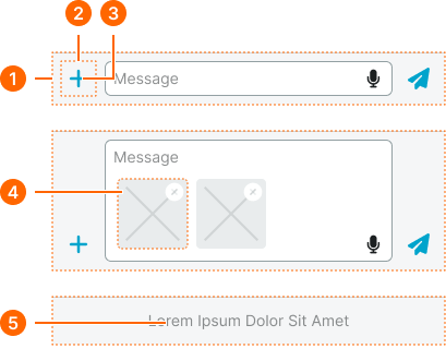
1
Message Form
- verticalPadding:
- space.base.8
- horizontalPadding:
- space.base.8
- itemSpacing:
- space.base.8
- fill:
- color.message.bg-form
2
Message Button
- width:
- size.base.40
- height:
- size.base.40
3
Button Icon
- width:
- size.base.32
- height:
- size.base.32
- fill:
- color.message.fg-form
4
Attachment Preview
- width:
- size.base.64
- height:
- size.base.64
- borderRadius:
- borderRadius.context.medium
5
Disabled Text
- fill:
- color.context.default.fg-subtle
- typography:
- font.text.small.normal
Embed Item
Specifications for embedded content elements including measurements, colors, and layout styling attributes. These values define the rich media integration and reply threading properties for embedded content variants with image and text display capabilities.
1
Embed Message
- verticalPadding:
- space.base.8
- horizontalPadding:
- space.base.8
2
Content Frame
- type:
- image
- fill:
- color.message.bg-embed
- borderRadius:
- borderRadius.context.small
- type:
- reply, image-reply
- fill:
- color.context.default.dim-slight
- borderRadius:
- borderRadius.context.small
- borderColor:
- color.context.default.cue-main
- borderWidthLeft:
- borderWidth.asset.indicator
3
Text Frame
- verticalPadding:
- space.base.8
- horizontalPadding:
- space.base.12
4
Embed Text
- fill:
- color.message.fg-embed
- typography:
- font.text.small.normal
5
Shared Frame
- variant:
- default
- horizontalPadding:
- space.base.12
- paddingTop:
- space.base.4
- itemSpacing:
- space.base.8
- opacity:
- opacity.context.fg-subtle
6
Image Frame
- width:
- size.base.64
- height:
- size.base.64
Chat Status
Specifications for chat status indicator elements including measurements, colors, and typography styling attributes. These values define the delivery status and conversation state properties for status message variants with compact, detailed, and emphasized display capabilities.
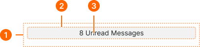
1
Chat Status
- horizontalPadding:
- space.base.8
- paddingTop:
- space.base.4
- paddingBottom:
- space.base.16
2
Text Frame
- type:
- compact, detailed
- verticalPadding:
- space.base.2
- horizontalPadding:
- space.base.8
- fill:
- color.context.default.bg-evident
- borderRadius:
- borderRadius.context.small
- type:
- emphasized
- verticalPadding:
- space.context.3xsmall
- horizontalPadding:
- space.context.small
- fill:
- color.context.black.dim-main
- borderRadius:
- borderRadius.context.small
- boxShadow:
- shadow.message.main
4
Status Text
- type:
- compact, detailed
- fill:
- color.context.default.fg-main
- typography:
- font.text.small.normal
- type:
- emphasized
- fill:
- color.context.black.fg-solid
- typography:
- font.text.small.normal