form-check
Selection controls including checkboxes and radio buttons that allow users to make binary choices or select from predefined options.
On this page
This documentation is a work in progress and may contain incomplete or outdated information. If you have any feedback or suggestions, please open an issue on GitHub.
Technical specifications and design system values that define the visual and structural properties of form check components. These specifications ensure consistent implementation across design tools and development environments.
Legend:
- Brackets (
[]) denote a component variant placeholder. - Full emphasis indicates a value specific to that variant.
- Dimmed indicates a value unchanged from the default variant.
Check Input
Specifications for individual checkbox and radio button elements including measurements, colors, and state styling. These values define the input control appearance.


1
Check Input
- size:
- medium
- state:
- idle, disabled, error, success
- height:
- size.icon.glyph.small
- width:
- size.icon.glyph.small
- fill:
- color.form-input.[state].bg-regular
- borderColor:
- color.form-input.[state].border
- borderWidth:
- borderWidth.form-input.regular
- borderRadius:
- borderRadius.context.xsmall
- size:
- large
- state:
- idle, disabled, error, success
- height:
- size.icon.glyph.medium
- width:
- size.icon.glyph.medium
- fill:
- color.form-input.[state].bg-regular
- borderColor:
- color.form-input.[state].border
- borderWidth:
- borderWidth.form-input.regular
- borderRadius:
- borderRadius.context.xsmall
- size:
- small
- state:
- idle, disabled, error, success
- height:
- size.icon.glyph.xsmall
- width:
- size.icon.glyph.xsmall
- fill:
- color.form-input.[state].bg-regular
- borderColor:
- color.form-input.[state].border
- borderWidth:
- borderWidth.form-input.regular
- borderRadius:
- borderRadius.context.xsmall
- state:
- primary
- height:
- size.icon.glyph.small
- width:
- size.icon.glyph.small
- fill:
- color.context.primary.base-color
- borderColor:
- color.context.primary.base-color
- borderWidth:
- borderWidth.form-input.regular
- borderRadius:
- borderRadius.context.xsmall
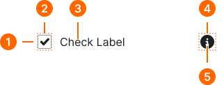
2
Check Icon
- state:
- idle, disabled, error, success
- fill:
- color.form-input.[state].fg-active
- state:
- primary
- fill:
- color.context.primary.contrast-color
Form Check
Specifications for complete form check layouts including label and input elements. These values define the structural appearance and spacing properties.
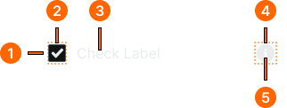
1
Form Check
- gap:
- space.form-input.[size]-gap
2
Input Frame
- verticalPadding:
- space.unit.2
3
Check Text
- fill:
- color.form-input.[state].fg-[active|inactive]
- typography:
- font.text.[size].normal
4
Input Help
- itemSpacing:
- space.unit.8
5
Help Icon
- height:
- size.form-input.[size]-icon
- width:
- size.form-input.[size]-icon
- fill:
- color.form-input.[state].help