comment
User-generated content components that display feedback, discussions, or conversational threads with author information and timestamps.
Technical specifications and design system values that define the visual and structural properties of comment components. These specifications ensure consistent implementation across design tools and development environments for discussion and collaborative communication interfaces.
Legend:
- Brackets (
[]) denote a component variant placeholder. - Full emphasis indicates a value specific to that variant.
- Dimmed indicates a value unchanged from the default variant.
Comment Item
Specifications for individual comment elements including measurements, colors, typography, and styling attributes. These values define the core appearance and behavior properties for each comment item variant with discussion and collaborative content capabilities.
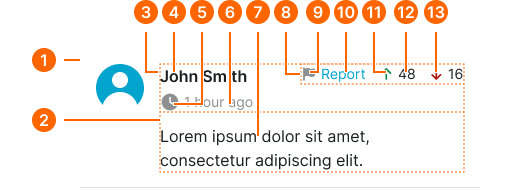
1
Comment Item
- flush:
- false
- verticalPadding:
- space.context.medium
- horizontalPadding:
- space.context.medium
- itemSpacing:
- space.context.medium
- flush:
- true
- verticalPadding:
- space.context.medium
- horizontalPadding:
- none
- itemSpacing:
- space.context.medium
2
Content Frame
- itemSpacing:
- space.context.small
3
Meta Frame
- size:
- large
- itemSpacing:
- space.context.2xsmall
- size:
- small
- itemSpacing:
- space.context.small
4
User Text
- fill:
- color.context.default.fg-main
- typography:
- font.text.medium.strong
5
Time Icon
- width:
- size.icon.glyph.small
- height:
- size.icon.glyph.small
- fill:
- color.context.default.fg-subtle
6
Time Text
- fill:
- color.context.default.fg-subtle
- typography:
- font.text.small.normal
7
Comment Text
- fill:
- color.context.default.fg-main
- typography:
- font.text.medium.normal
8
Actions Frame
Absolutely positioned at the top right of the content frame, it contains nested frames for each action.
- itemSpacing:
- space.context.small
9
Report Icon
- width:
- size.icon.glyph.xsmall
- height:
- size.icon.glyph.xsmall
- fill:
- color.context.default.fg-subtle
10
Report Text
- fill:
- color.context.default.link-main
- typography:
- font.text.small.normal
11
Up Vote Icon
- width:
- size.icon.glyph.xsmall
- height:
- size.icon.glyph.xsmall
- fill:
- color.context.success.fg-main
12
Up Vote Text
- fill:
- color.context.default.fg-main
- typography:
- font.text.small.normal
13
Down Vote Icon
- width:
- size.icon.glyph.xsmall
- height:
- size.icon.glyph.xsmall
- fill:
- color.context.danger.fg-main
14
Down Vote Text
- fill:
- color.context.default.fg-main
- typography:
- font.text.small.normal
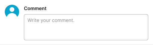
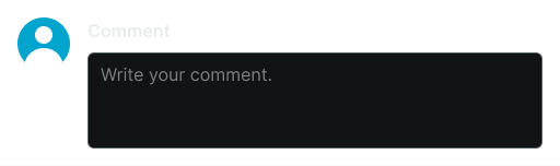
Comment Form
Specifications for comment input interface elements including measurements, colors, typography, and interaction styling attributes. These values define the form structure and content creation properties for comment form variants with collaborative input capabilities.