chip
Compact elements representing input, attributes, or actions, often used for tags, filters, or selections that can be added or removed.
Technical specifications and design system values that define the visual and structural properties of chip components. These specifications ensure consistent implementation across design tools and development environments.
Legend:
- Brackets (
[]) denote a component variant placeholder. - Full emphasis indicates a value specific to that variant.
- Dimmed indicates a value unchanged from the default variant.
Solid Chip
Specifications for chip elements including measurements, colors, typography, and styling attributes. These values define the core appearance and selection behavior properties for each chip variant.
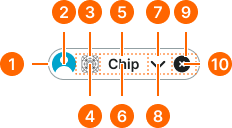
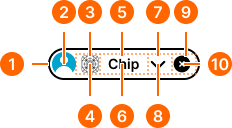
1
Chip
The chip frame should not have any gaps in the Figma component.
- context:
- default, alternate
- state:
- idle, hover, press
- minHeight:
- size.chip.[size]-main
- verticalPadding:
- space.chip.[size]-padding-y
- horizontalPadding:
- space.chip.[size]-padding-x
- fill:
- color.context.[context].bg-[state]
- borderColor:
- color.context.[context].border-main
- borderRadius:
- borderRadius.chip.[size]
- borderWidth:
- borderWidth.chip
- context:
- default, alternate
- state:
- disabled
- minHeight:
- size.chip.[size]-main
- verticalPadding:
- space.chip.[size]-padding-y
- horizontalPadding:
- space.chip.[size]-padding-x
- fill:
- color.context.[context].bg-[state]
- borderColor:
- color.context.[context].transparent-color
- borderRadius:
- borderRadius.chip.[size]
- borderWidth:
- borderWidth.chip.main
- context:
- primary, secondary, neutral, danger, success, warning, info, black, white
- state:
- any
- minHeight:
- size.chip.[size]-main
- verticalPadding:
- space.chip.[size]-padding-y
- horizontalPadding:
- space.chip.[size]-padding-x
- fill:
- color.context.[context].bg-[state]
- borderColor:
- color.context.[context].transparent-color
- borderRadius:
- borderRadius.chip.[size]
- borderWidth:
- borderWidth.chip.main
2
Avatar
- height:
- size.chip.[size]-avatar
- width:
- size.chip.[size]-avatar
3
Icon Frame
In Figma, the nudge token is used for spacing in addition to the padding property on the chip frame.
- paddingLeft:
- space.chip.[size]-nudge
4
Icon
- height:
- size.chip.[size]-icon
- width:
- size.chip.[size]-icon
- fill:
- color.context.[context].fg-[state]
5
Label Frame
In Figma, the gap token is utilized for spacing purposes rather than using the gap property on the chip frame.
- horizontalPadding:
- space.chip.[size]-gap
6
Label Text
- fill:
- color.context.[context].fg-[state]
- typography:
- font.chip.[size]
7
Dropdown Frame
In Figma, the nudge token is used for spacing in addition to the padding property on the chip frame.
- paddingRight:
- space.chip.[size]-nudge
8
Dropdown Icon
- height:
- size.chip.[size]-icon
- width:
- size.chip.[size]-icon
- fill:
- color.context.[context].fg-[state]
9
Dismiss Frame
In Figma, the nudge token is used for spacing in addition to the padding property on the chip frame.
- paddingRight:
- space.chip.[size]-nudge
10
Dismiss Icon
- height:
- size.chip.[size]-icon
- width:
- size.chip.[size]-icon
- fill:
- color.context.[context].fg-[state]
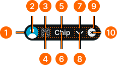
Smooth Chip
Specifications for chip elements including measurements, colors, typography, and styling attributes. These values define the core appearance and selection behavior properties for each chip variant.
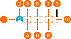
1
Chip
The chip frame should not have any gaps in the Figma component.
- state:
- idle, press, disabled
- minHeight:
- size.chip.[size]-main
- verticalPadding:
- space.chip.[size]-padding-y
- horizontalPadding:
- space.chip.[size]-padding-x
- fill:
- color.context.[context].bg-evident
- borderColor:
- color.context.[context].transparent-color
- borderRadius:
- borderRadius.chip.[size]
- borderWidth:
- borderWidth.chip.main
- state:
- hover
- minHeight:
- size.chip.[size]-main
- verticalPadding:
- space.chip.[size]-padding-y
- horizontalPadding:
- space.chip.[size]-padding-x
- fill:
- color.context.[context].bg-even
- borderColor:
- color.context.[context].transparent-color
- borderRadius:
- borderRadius.chip.[size]
- borderWidth:
- borderWidth.chip.main
2
Avatar
- height:
- size.chip.[size]-avatar
- width:
- size.chip.[size]-avatar
3
Icon Frame
In Figma, the nudge token is used for spacing in addition to the padding property on the chip frame.
- paddingLeft:
- space.chip.[size]-nudge
4
Icon
- state:
- idle, hover, press
- height:
- size.chip.[size]-icon
- width:
- size.chip.[size]-icon
- fill:
- color.context.[context].fg-main
- state:
- disabled
- height:
- size.chip.[size]-icon
- width:
- size.chip.[size]-icon
- fill:
- color.context.[context].fg-slight
5
Label Frame
In Figma, the gap token is utilized for spacing purposes rather than using the gap property on the chip frame.
- horizontalPadding:
- space.chip.[size]-gap
6
Label Text
- state:
- idle, hover, press
- fill:
- color.context.[context].fg-main
- typography:
- font.chip.[size]
- state:
- disabled
- fill:
- color.context.[context].fg-slight
- typography:
- font.chip.[size]
7
Dropdown Frame
In Figma, the nudge token is used for spacing in addition to the padding property on the chip frame.
- paddingRight:
- space.chip.[size]-nudge
8
Dropdown Icon
- state:
- idle, hover, press
- height:
- size.chip.[size]-icon
- width:
- size.chip.[size]-icon
- fill:
- color.context.[context].fg-main
- state:
- disabled
- height:
- size.chip.[size]-icon
- width:
- size.chip.[size]-icon
- fill:
- color.context.[context].fg-slight
9
Dismiss Frame
In Figma, the nudge token is used for spacing in addition to the padding property on the chip frame.
- paddingRight:
- space.chip.[size]-nudge
10
Dismiss Icon
- state:
- idle, hover, press
- height:
- size.chip.[size]-icon
- width:
- size.chip.[size]-icon
- fill:
- color.context.[context].fg-main
- state:
- disabled
- height:
- size.chip.[size]-icon
- width:
- size.chip.[size]-icon
- fill:
- color.context.[context].fg-disabled
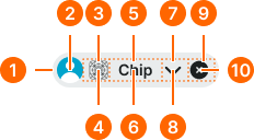
Outline Chip
Specifications for chip elements including measurements, colors, typography, and styling attributes. These values define the core appearance and selection behavior properties for each chip variant.
1
Chip
The chip frame should not have any gaps in the Figma component.
- state:
- idle
- minHeight:
- size.chip.[size]-main
- verticalPadding:
- space.chip.[size]-padding-y
- horizontalPadding:
- space.chip.[size]-padding-x
- fill:
- color.context.[context].transparent-color
- borderColor:
- color.context.[context].base-color
- borderRadius:
- borderRadius.chip.[size]
- borderWidth:
- borderWidth.context.large
- state:
- hover, press
- minHeight:
- size.chip.[size]-main
- verticalPadding:
- space.chip.[size]-padding-y
- horizontalPadding:
- space.chip.[size]-padding-x
- fill:
- color.context.[context].dim-slight
- borderColor:
- color.context.[context].base-color
- borderRadius:
- borderRadius.chip.[size]
- borderWidth:
- borderWidth.chip.main
- state:
- disabled
- minHeight:
- size.chip.[size]-main
- verticalPadding:
- space.chip.[size]-padding-y
- horizontalPadding:
- space.chip.[size]-padding-x
- fill:
- color.context.[context].transparent-color
- borderColor:
- color.context.[context].fg-slight
- borderRadius:
- borderRadius.chip.[size]
- borderWidth:
- borderWidth.chip
2
Avatar
- height:
- size.chip.[size]-avatar
- width:
- size.chip.[size]-avatar
3
Icon Frame
In Figma, the nudge token is used for spacing in addition to the padding property on the chip frame.
- paddingLeft:
- space.chip.[size]-nudge
4
Icon
- state:
- idle, hover
- height:
- size.chip.[size]-icon
- width:
- size.chip.[size]-icon
- fill:
- color.context.[context].base-color
- state:
- press
- height:
- size.chip.[size]-icon
- width:
- size.chip.[size]-icon
- fill:
- color.context.[context].fg-main
- state:
- disabled
- height:
- size.chip.[size]-icon
- width:
- size.chip.[size]-icon
- fill:
- color.context.[context].fg-slight
5
Label Frame
In Figma, the gap token is utilized for spacing purposes rather than using the gap property on the chip frame.
- horizontalPadding:
- space.chip.[size]-gap
6
Label Text
- state:
- idle, hover
- fill:
- color.context.[context].base-color
- typography:
- font.chip.[size]
- state:
- press
- fill:
- color.context.[context].fg-main
- typography:
- font.chip.[size]
- state:
- disabled
- fill:
- color.context.[context].fg-slight
- typography:
- font.chip.[size]
7
Dropdown Frame
In Figma, the nudge token is used for spacing in addition to the padding property on the chip frame.
- paddingRight:
- space.chip.[size]-nudge
8
Dropdown Icon
- state:
- idle, hover
- height:
- size.chip.[size]-icon
- width:
- size.chip.[size]-icon
- fill:
- color.context.[context].base-color
- state:
- press
- height:
- size.chip.[size]-icon
- width:
- size.chip.[size]-icon
- fill:
- color.context.[context].fg-main
- state:
- disabled
- height:
- size.chip.[size]-icon
- width:
- size.chip.[size]-icon
- fill:
- color.context.[context].fg-slight
9
Dismiss Frame
In Figma, the nudge token is used for spacing in addition to the padding property on the chip frame.
- paddingRight:
- space.chip.[size]-nudge
10
Dismiss Icon
- state:
- idle, hover
- height:
- size.chip.[size]-icon
- width:
- size.chip.[size]-icon
- fill:
- color.context.[context].base-color
- state:
- press
- height:
- size.chip.[size]-icon
- width:
- size.chip.[size]-icon
- fill:
- color.context.[context].fg-main
- state:
- disabled
- height:
- size.chip.[size]-icon
- width:
- size.chip.[size]-icon
- fill:
- color.context.[context].fg-slight