button-smooth
Interactive elements with smooth styling that create subtle visual hierarchy and clear action affordance for secondary and contextual user interactions.
On this page
This documentation is a work in progress and may contain incomplete or outdated information. If you have any feedback or suggestions, please open an issue on GitHub.
Technical specifications and design system values that define the visual and structural properties of smooth button components. These specifications ensure consistent implementation across design tools and development environments.
Legend:
- Brackets (
[]) denote a component variant placeholder. - Full emphasis indicates a value specific to that variant.
- Dimmed indicates a value unchanged from the default variant.
Smooth Buttons
Specifications for button elements including measurements, colors, typography, and styling attributes. These values define the core appearance and behavior properties for each button variant.
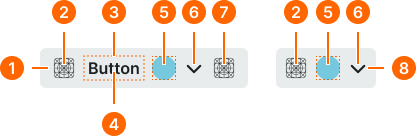
1
Smooth Button
- state:
- idle, press, disabled
- minHeight:
- size.button.[size]-main
- minWidth:
- size.button.[size]-main
- verticalPadding:
- space.button.[size]-padding-y
- horizontalPadding:
- space.button.[size]-padding-x
- itemSpacing:
- space.button.[size]-gap
- fill:
- color.context.[context].bg-evident
- borderRadius:
- borderRadius.button.[size]
- state:
- hover
- minHeight:
- size.button.[size]-main
- minWidth:
- size.button.[size]-main
- verticalPadding:
- space.button.[size]-padding-y
- horizontalPadding:
- space.button.[size]-padding-x
- itemSpacing:
- space.button.[size]-gap
- fill:
- color.context.[context].bg-even
- borderRadius:
- borderRadius.button.[size]
2
Icon Start
- state:
- idle, hover, press
- height:
- size.button.[size]-icon
- width:
- size.button.[size]-icon
- fill:
- color.context.[context].fg-main
- state:
- disabled
- height:
- size.button.[size]-icon
- width:
- size.button.[size]-icon
- fill:
- color.context.[context].fg-slight
3
Label Frame
Text only buttons require increased horizontal padding.
- horizontalPadding:
- space.button.[size]-nudge
4
Label Text
- state:
- idle, hover, press
- fill:
- color.context.[context].fg-main
- typography:
- font.button.[size]
- state:
- idle, hover, press
- fill:
- color.context.[context].fg-slight
- typography:
- font.button.[size]
5
Badge Frame
- state:
- idle, hover, press
- opacity:
- opacity.level.solid
- state:
- disabled
- opacity:
- opacity.context.fg-slight
6
Caret Icon
- state:
- idle, hover, press
- height:
- size.button.[size]-caret
- width:
- size.button.[size]-caret
- fill:
- color.context.[context].fg-main
- state:
- idle, hover, press
- height:
- size.button.[size]-caret
- width:
- size.button.[size]-caret
- fill:
- color.context.[context].fg-slight
7
Icon End
- state:
- idle, hover, press
- height:
- size.button.[size]-icon
- width:
- size.button.[size]-icon
- fill:
- color.context.[context].fg-main
- state:
- idle, hover, press
- height:
- size.button.[size]-icon
- width:
- size.button.[size]-icon
- fill:
- color.context.[context].fg-slight
8
Smooth Icon-Button
- state:
- idle, press, disabled
- minHeight:
- size.button.[size]-main
- minWidth:
- size.button.[size]-main
- verticalPadding:
- space.button.[size]-padding-y
- horizontalPadding:
- space.button.[size]-padding-x
- itemSpacing:
- space.button.[size]-gap
- fill:
- color.context.[context].bg-evident
- borderRadius:
- borderRadius.button.[size]
- state:
- hover
- minHeight:
- size.button.[size]-main
- minWidth:
- size.button.[size]-main
- verticalPadding:
- space.button.[size]-padding-y
- horizontalPadding:
- space.button.[size]-padding-x
- itemSpacing:
- space.button.[size]-gap
- fill:
- color.context.[context].bg-even
- borderRadius:
- borderRadius.button.[size]