breadcrumb
Navigation components that display the current page location within the site hierarchy, enabling users to understand their position and navigate to parent pages.
Technical specifications and design system values that define the visual and structural properties of breadcrumb components. These specifications ensure consistent implementation across design tools and development environments.
Legend:
- Brackets (
[]) denote a component variant placeholder. - Full emphasis indicates a value specific to that variant.
- Dimmed indicates a value unchanged from the default variant.
Large Breadcrumb
Specifications for breadcrumb navigation elements including measurements, colors, typography, and hierarchical styling attributes. These values define the visual presentation and interaction properties.
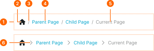
1
Large Breadcrumb
- flush:
- false
- verticalPadding:
- space.context.medium
- horizontalPadding:
- space.context.medium
- itemSpacing:
- space.context.xsmall
- flush:
- true
- verticalPadding:
- none
- horizontalPadding:
- none
- itemSpacing:
- space.context.xsmall
2
Home Icon
- height:
- size.icon.glyph.medium
- width:
- size.icon.glyph.medium
- fill:
- color.context.default.fg-main
3
Separator
- fill:
- color.context.default.fg-subtle
- typography:
- font.text.medium.normal
4
Level Text
- fill:
- color.context.default.link-main
- typography:
- font.text.medium.normal
5
Current Text
- fill:
- color.context.default.fg-subtle
- typography:
- font.text.medium.normal
6
Separator
- height:
- size.icon.glyph.small
- width:
- size.icon.glyph.small
- fill:
- color.context.default.fg-subtle
Small Breadcrumb
Specifications for compact breadcrumb navigation suitable for mobile viewports or constrained spaces. These values ensure optimal presentation in limited screen real estate.
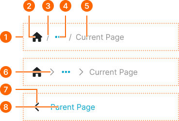
1
Small Breadcrumb
- type:
- icon-separator
- flush:
- false
- verticalPadding:
- space.context.medium
- horizontalPadding:
- space.context.medium
- itemSpacing:
- space.context.xsmall
- flush:
- true
- verticalPadding:
- none
- horizontalPadding:
- none
- itemSpacing:
- space.context.xsmall
- type:
- parent-button
- verticalPadding:
- space.context.medium
- horizontalPadding:
- space.context.medium
- itemSpacing:
- space.context.medium
2
Home Icon
- height:
- size.icon.glyph.medium
- width:
- size.icon.glyph.medium
- fill:
- color.context.default.fg-main
3
Separator
- fill:
- color.context.default.fg-subtle
- typography:
- font.text.medium.normal
4
Ellipsis Icon
- height:
- size.icon.glyph.medium
- width:
- size.icon.glyph.medium
- fill:
- color.context.default.link-main
5
Current Text
- fill:
- color.context.default.fg-subtle
- typography:
- font.text.medium.normal
6
Separator
- height:
- size.icon.glyph.small
- width:
- size.icon.glyph.small
- fill:
- color.context.default.fg-subtle
7
Back Icon
- height:
- size.icon.glyph.medium
- width:
- size.icon.glyph.medium
- fill:
- color.context.default.fg-main
8
Parent Text
- fill:
- color.context.default.link-main
- typography:
- font.text.medium.normal